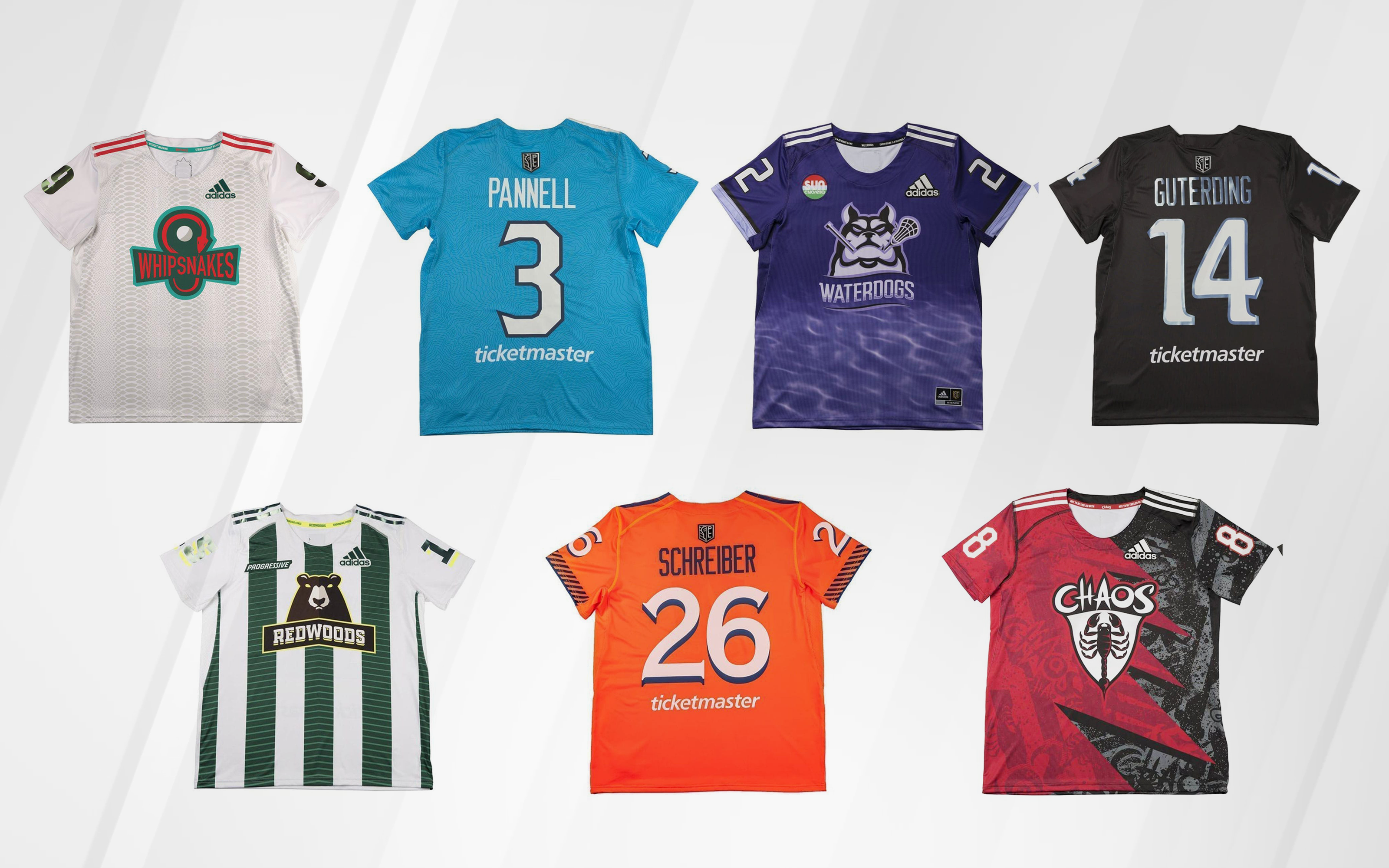
With just over two weeks left before the PLL Championship Series, the PLL kicked off the celebration early by dropping the new looks each team will be sporting when the tournament starts July 25.
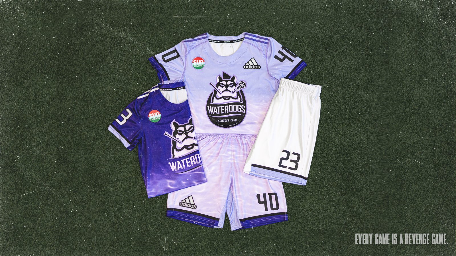
The league revealed the Waterdogs’ new set on July 8. They followed that up on July 9 with new jerseys for the Chaos, Chrome and Redwoods, then revealed updated jerseys for the Archers, Atlas, and Whipsnakes on July 10.
The jerseys were a popular draw on the PLL website. The league sold out of multiple sizes of Ryan Drenner Waterdogs jerseys within the first 24 hours.
Drenner wasn’t the only player to receive his first replica jersey. Other players that had their jersey go up for sale for the first time included, Jarrod Neumann, Ryder Garnsey, Connor Farrell and Rob Pannell.
The Waterdogs jersey featured a front-facing jersey sponsor patch for Sun Chlorella, as well as branding below the back numbers for Ticketmaster. The Ticketmaster branding appears is uniform across the league, as Ticketmaster enters its first season as the presenting sponsor of the league.
The Redwoods also joined the Waterdogs and Atlas as teams to have a branded sponsor patch on the front, with Redwoods rocking a Progressive insurance patch and Atlas wearing a Capital One patch like last season.
While five of the original six teams underwent slight aesthetic changes, the league decided to completely revamp the Chaos jerseys. Both their white and black jerseys underwent significant overhauls. Opinions on the new Chaos jerseys were split (pun intended), so you can decide for yourself.
Report Card
Atlas LC: A
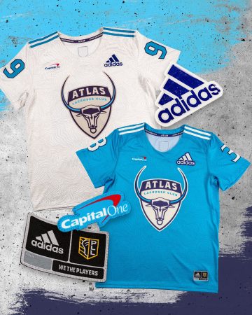
The Atlas left their jersey largely untouched. Their jerseys were already some of the better ones in the league. As the old saying goes, if it ain’t broke, don’t fix it.
Archers LC: A+
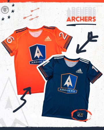
The Archers’ blue jersey was already slick, but the orange jersey put them over the top and made them the winner of the PLL’s day three jersey releases. The Archers will be one of the more colorful teams on the field for the tournament.

Chrome: C
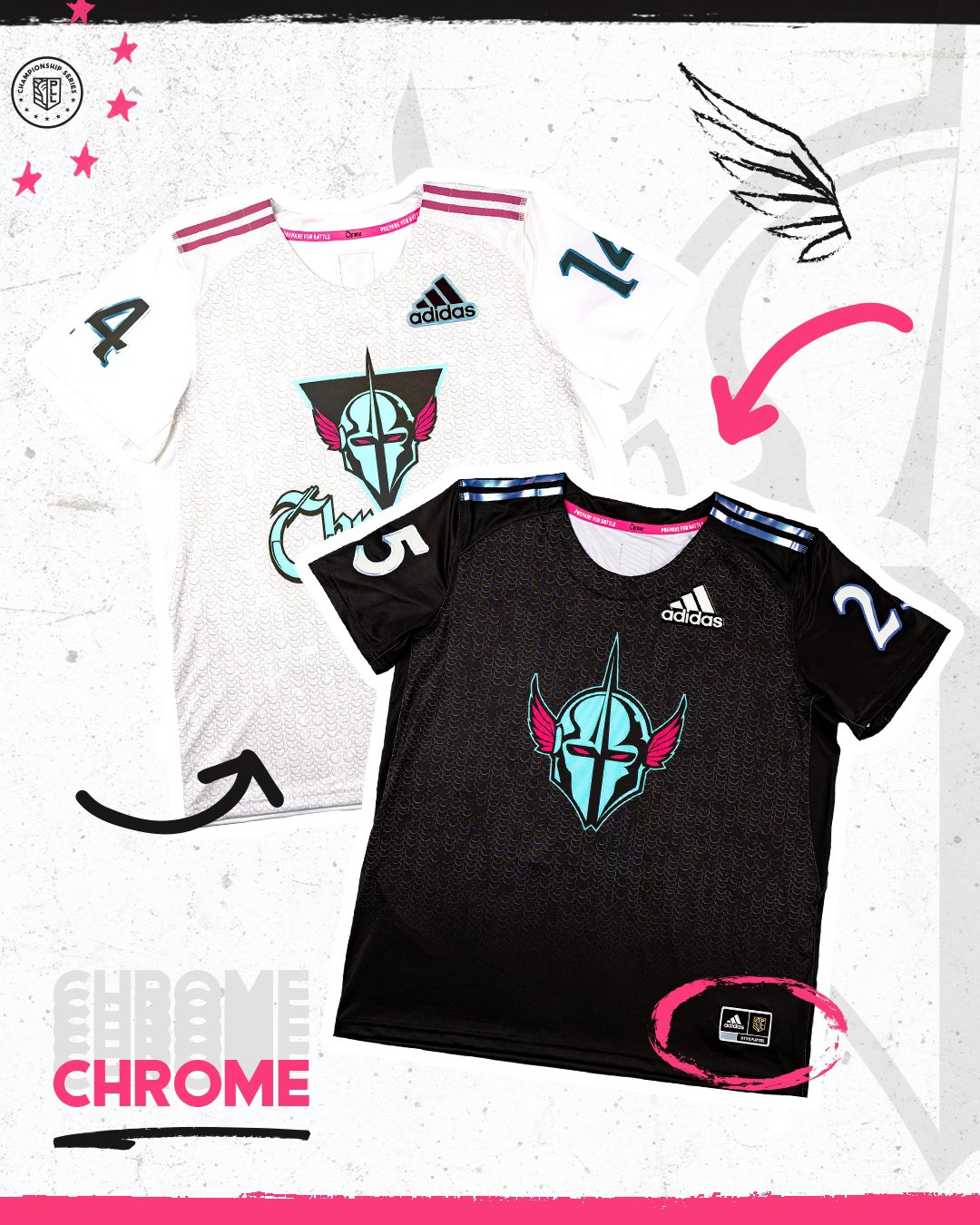
Chrome LC has one of the more fun color pallets in the league. As they look to establish themselves after a disappointing first campaign, it feels like the league could have done something a bit more than add some highlights to their existing jerseys. While there’s nothing particularly wrong about these jerseys, they could have done more.
Chaos: A
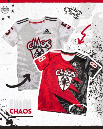
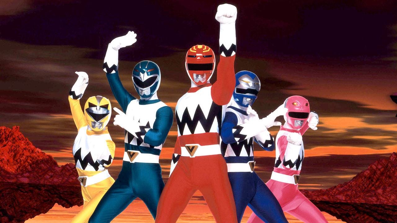
The league went all out for the Chaos. Both the white and dark jerseys underwent dramatic overhauls. Feel free to form your own opinion, but the league clearly wants to make a statement with the Chaos jerseys. Mission accomplished. Personally, I’m a big fan of the red and black jersey, even if it looks slightly inspired by the red Power Ranger.
Redwoods: B+
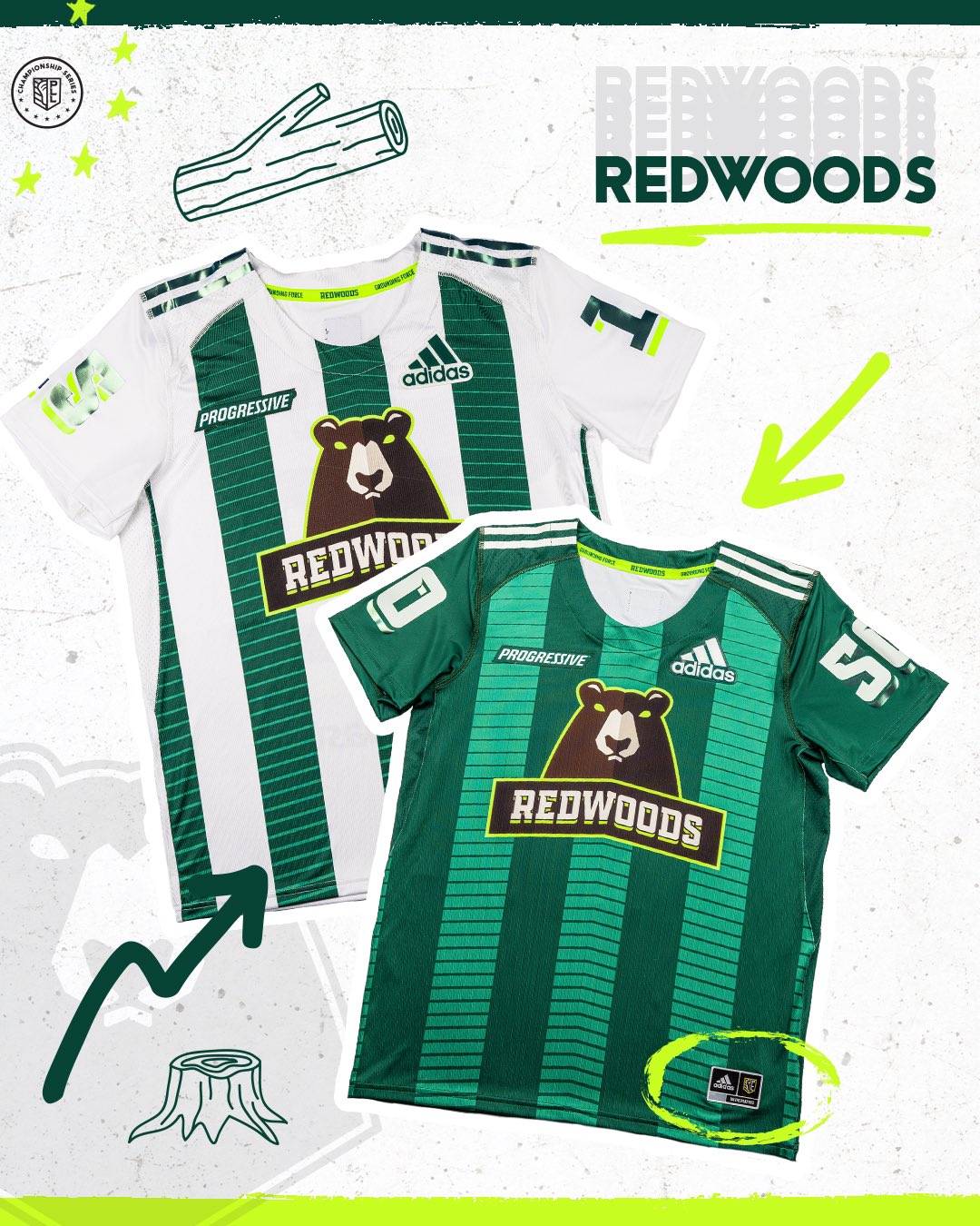
The Redwoods jersey actually underwent some pretty big changes. Gone are the stripes in the form of trees, replaced with standard straight stripes. The white jersey also did away with the maroon stripes in favor of the green ones. They also added a jersey sponsor in Progressive, but the patch is understated and it might even be overlooked at first glance. Overall a great new look for the Woods.
Waterdogs: B-
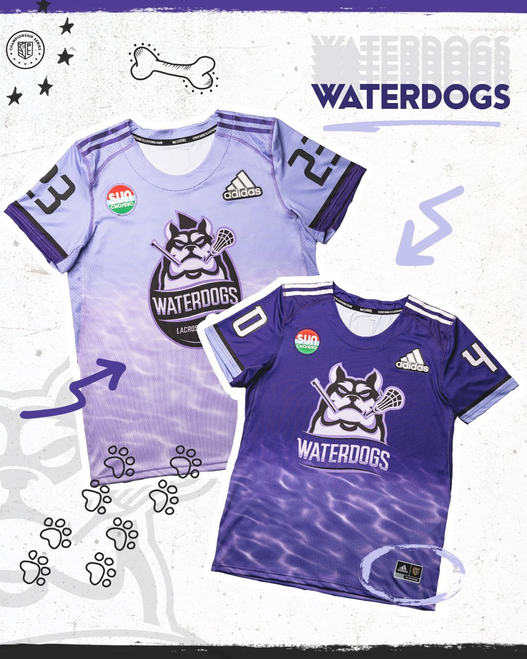
The Waterdogs jerseys are nice. The purple shades look great, and the water inlay is a cool feature. Unfortunately the sponsor patch is an eyesore. It distracts from the rest of the jersey and its disappointing they could not find a way to make it fit in better like on the Atlas and Redwoods jerseys. Big points off for the ugly patch.

Whipsnakes: B+
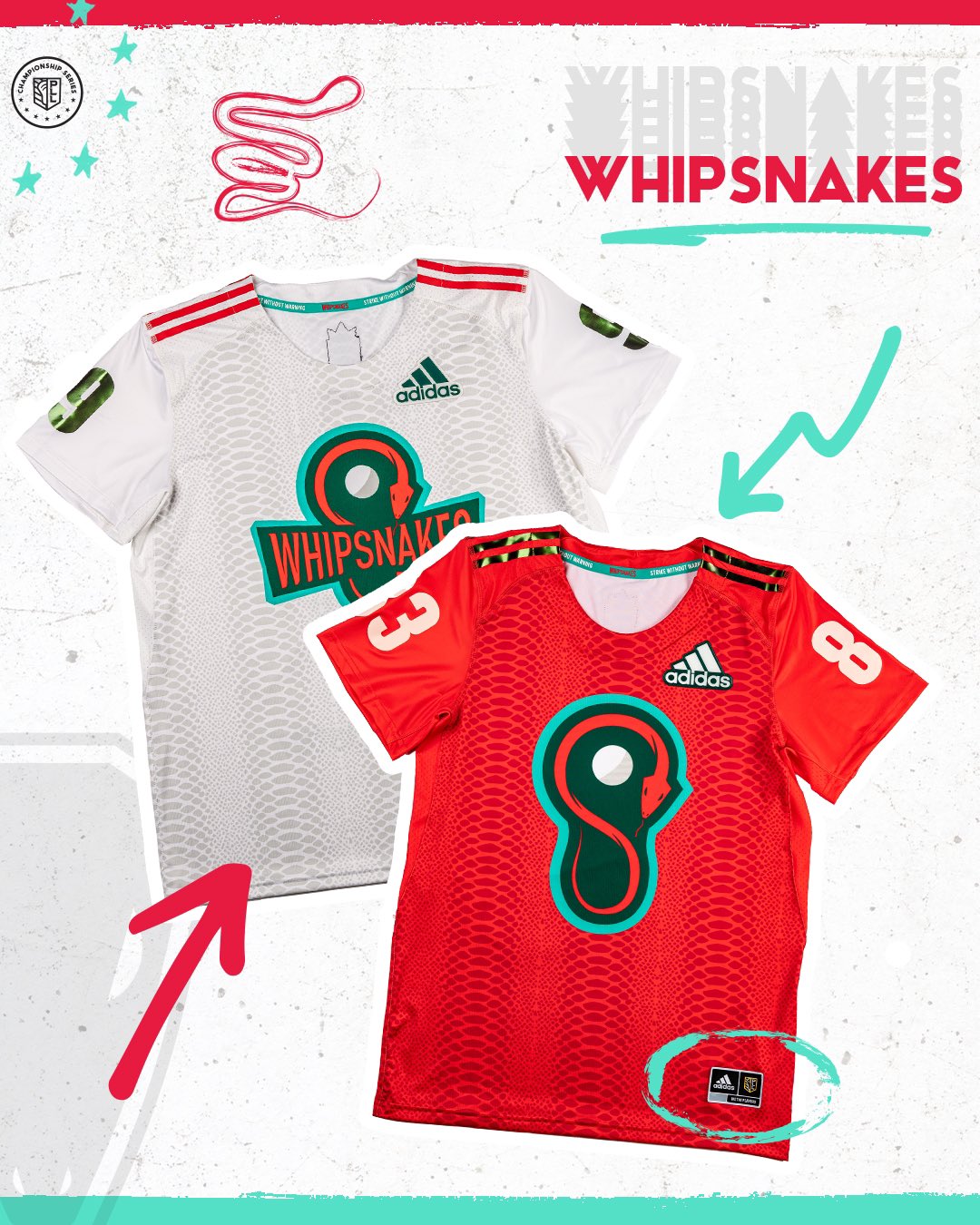
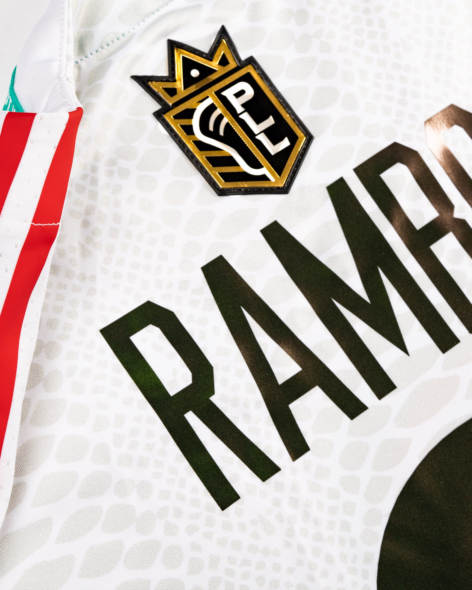
The champs will return mostly the same look as last season. They had a great look last year. The Whips will also feature gold highlights on the red jersey, as well as a crown on the PLL logo on the back. Another jersey that didn’t need much updating, and the updates that were made look good.
Which newly released PLL jersey is your favorite? Which ones disappointed you? Let us know in the comments or on social media using the #PLLUniWatch.
Subscribe to and rate the Pro Lacrosse Talk podcast:

